There’s nothing more likely to fire up a native New Yorker than the state of the Subway — you hear it talked over in delis and corner shops and on television, and one of the juiciest debates starts up when it comes to the map of the Subway. There are those who recall the baroque beauty of the Hagstrom maps of the 1930s to 1950s which they held on to when racing out to Coney Island as kids. Others, whose heyday was the late fifties, will recall the clinical clarity of the Salomon diagram map.
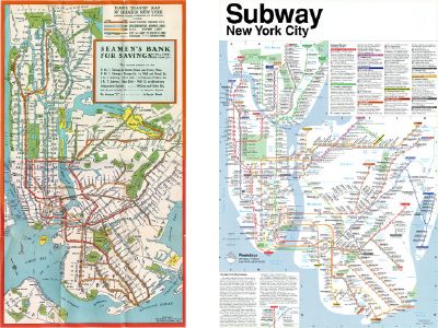 But, ever since a design contest in 1964 — one of the winners being the dashing young lawyer Raleigh D’Adamo — the controversy over how the 772 miles of subway lines and countless service permutations are presented to riders has raged sporadically. Things came to a head when world-renowned Italian designer Massimo Vignelli presented his re-working of the map in an artist’s palette of bright colors and neat forty-five-degree diagonals. This was published in 1972. Many graphic design buffs and visitors found it superbly stylish and, like Salomon’s 1958 map, comparable in clarity to the London Underground diagram designed by Harry Beck in 1933.
But many others found the abstraction made the map difficult to use. In 1975, theTransit Authority set up a Subway Map Committee, chaired for most of its three years by John Tauranac — which labored to re-design the map and incorporate into it the staggering quantity of detailed service information that New Yorkers need to use their Subway. Under the direction of the Committee, Michael Hertz Associates put together a map that combined the beautifully flowing lines of artist Nobuyuki Siraisi with the dense assemblage of service data. This completely new map was published in 1979. It’s been the key to the way New Yorkers look at the city beneath their feet for the last thirty years.
Vignelli (who in the meantime had been called upon by the RATP for a major new design project on the RER system), was understandably dismayed by the Transit Authority’s decision to abandon his schematic in favor of a much more geographic approach and the differences of opinion famously surfaced at a public debate in Cooper Union Great Hall in July 1978. Since that date, none of the main protagonists have been in the same room together until last Saturday. It was a love of transportation cartography that brought Vignelli, D’Adamo, and Tauranac under one roof — appropriately at New York’s atmospheric Transit Museum. They all came for a talk on mapping the Paris Métro. This was a peculiarly pertinent occasion, as Vignelli himself designed the regional transportation map of Paris in the 1990s, which in turn pushed the actual Métro map into a more diagrammatic direction. Nor was the Paris Métro unfamiliar to Tauranac, who once designed a map of the Métro — executed, like the 1979 New York map, by Michael Hertz, but never published.
The recent elevation of interest in the complex skill of transit cartography — especially since the publication of the first global book on the subject (Transit Maps of the World, Penguin, 2007) — seems to have forged some unity among both professionals and amateurs alike. But New York has the most complex subway system in the world, and no single map will ever capture all its nuances in a form that will satisfy all its riders. So there’s little chance that the talented minds in New York Subway map design — Vignelli, Tauranac, D’Adamo, Hertz, Siraisi — will ever agree with each other on a single all-purpose design. But the good news is that now the maps and the mechanics of making them is so much more in the public eye, that there is growing respect for each man’s work.
This was clear at another meeting a few days later — in the Mid-Manhattan Branch of the New York Public Library on Tuesday, October 27 (the 105th anniversary of the opening of the Subway). Around 130 people turned up to listen to a talk by John Tauranac on the history of mapping the New York Subway. John gave a thorough background to the story of how the city’s system has been presented to the public but saved the crux of his thoughts for the comparison between how each mapmaker has solved one particularly thorny issue: the Bleecker Street interchange from Line 6 to the B, D, F and V (at Broadway Lafayette) — or more accurately the complexity of it. Bleecker Street is odd because it is possible to transfer onto the other lines from the 6 on the downtown bound platform only. You just can’t do it from the uptown bound side. Tauranac — who describes himself as “a guide” — sees this level of information as crucial to using the system. It was from this perspective of demanding complete accuracy over station placing that he first took exception to Vignelli’s 1972 diagram. “No matter how aesthetically pleasing the thing was to look at,” he told the capacity crowd at the Library, “some stations were just in the wrong place.” Indeed, John saved his strongest criticism for Vignelli’s widely acclaimed 2008 revision of the famous diagram because, despite many improvements, the Bleecker Street transfer was still shown incorrectly. “On Vignelli’s new diagram it looks like the transfer is possible only in the uptown direction — but of course it’s the other way round!” lamented John.
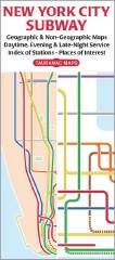 A visit a few days earlier to Tauranac's apartment had uncovered a wealth of historical material on the evolution of the 1979 map - plus a big surprise: John, a keen Francophile, had even attempted to spread the 1979 New York Subway map style to the Paris Metro - a small sample of which was tucked away in the corner of his office. Tauranac has designed a wide range of cartographic products for the city, incorporating what he regards as the best practice, but almost exclusively based on real geography — “parks are green and water is blue,” he explained to the gathered mass squashed into the library’s presentation room — as if one of us might dare leave thinking otherwise. But he’d reminded us earlier of one rather prophetic comment that arose during that Cooper Union debate: “Why don’t you just have two maps — one geographic the other schematic?” said one bright spark. As John came to his conclusions he unfolded his latest Subway map: “I’ve finally bitten the bullet,” he reveals to the dumbstruck crowd: “I’ve put a geographic map on one side and a schematic on the other.”
This coincidentally is the solution they’ve also adopted in Paris, where despite several early attempts to neaten up all those unruly interweaving lines, the Métro operator, the RATP, had long preferred a more Parisian feel (essentially quite accurately geographic). But in 2000 even they relented and provided passengers with a schematic network map inside the cars (and as a tiny pocket map also) and they have left the handy but strictly geographic map at station entrances and on platform walls — a very definite concession to the fact that any big transit operation is easier to navigate with the two-pronged approach of providing maps of both types.
Postscript
After the event at the Library, I make my way back to 23rd and 7th in the rain. I unravel the large MTA Subway map to find where I am relative to the station. It works. Bless that trusty thirty-year-old design! When I get to Times Square it’s the usual labyrinth full of chaos but I jump onto a 2 train only to realize I’m not actually sure the train will stop at 23rd. I’m unfolding the MTA Subway map again to double check. The large piece of frequently folded paper is damp and unwieldy in the crowded train. It opens rather unhelpfully at the other end of Long Island and as I trying to refold it to the appropriate section of Manhattan whilst clinging onto a strap to stop myself toppling over, I knock into a fellow passenger who scowls knowingly at the stupid tourist. A part of the paper drops off along the oft-folded crease and lands on the wet, dirty floor, but the doors have already opened at 34 St Penn Station and I’m not sure whether to change here onto the Local or wait ’till the next stop or even if this train stops at 23rd anyway. This is precisely where a small simple diagram would clearly have been jolly handy and as the doors close I realize I’m stuck on a Express which will zoom past 28th. Curses! The words of John’s talk are racing round my head as my stop at 23rd whizzes past at speed, and I’m frantically trying to reassemble the sodden mass before I get any further downtown.
But the scowler is a secret angel and recognizing my plight has fished out his iPhone and brought up an application (or “app”) which is a surprisingly clear answer to my needs. It’s the KickMap of the Subway, designed by Eddie Jabbour — a hybrid of a schematic with lots of surface geographic features. I thank the kind gentleman, making a note to download said app at the earliest opportunity, and get off at 14th to go back two stops on the nice Local. And I praise the cartographic equivalent of light at the end of the tunnel!

No comments:
Post a Comment